Widget: Progress Bar
The Progress Bar is a living status bar. It is designed to display at the top of a dataform. It updates when a user sets a value in the dataform lookup field that you have designated to populate the Progress Bar.
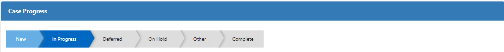
For example, you can use a Progress Bar on the Client Service Case dataform to display case statuses of New, In Progress, Deferred, On Hold, Other, Complete, etc. The current status displays with a dark blue background, prior statuses display with a lighter blue background while future statuses display with a gray background.
Clicking the current status once collapses the prior statuses:

Clicking the current status a second time returns the progress bar to its prior state:

To configure the Progress Bar Widget:
-
Go to System Admin
 > Widget Layouts.
 -
Add a new widget layout or click
 (Open) next to an existing layout in the grid to edit the widget layout.
 -
Set the Target Type . The Target Type must be a dataform, such as the Client Service Case dataform.
-
On the Widget Layout Details window, click the Add Widgets button.
The Widget Library window displays.
-
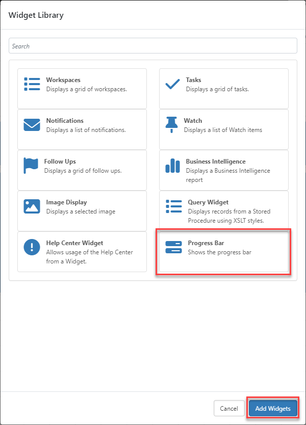
Click Progress Bar and then click Add Widgets as shown in the example screen below:
The Widget Library window closes. A Progress Bar Widget control displays on the Widget Layout Details screen.
-
Click the Settings
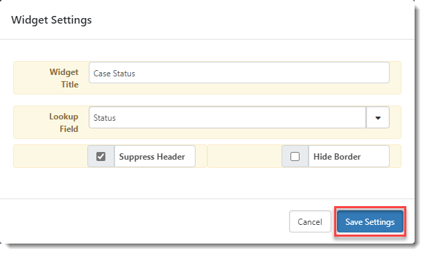
button on the Progress Bar Widget control.The Widget Settings window displays.
-
Complete the following fields as applicable.
Widget Title
Add a widget title. Example: Case Progress
Note:
-
Suppress Header must be unchecked to display a header.
-
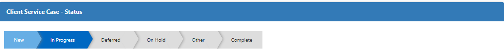
If you leave the Widget Title field empty (with Suppress Header unchecked), a default header is displayed comprised of the form name and the name of the Lookup Field you select to populate the progress bar. Example: Client Service Case - Status.
Lookup Field
Select the lookup group containing the values you want to use to populate the progress bar.
Note:
-
The system uses the lookup value Display Order setting to determine the order in which statuses display on the progress bar. You may need to adjust the display order of field values in the selected lookup to make the Progress Bar widget represent a meaningful workflow for users. (See Configuring Lookups for details.)
-
Lookup up values with no Display Order entered do not display on the progress bar.
-
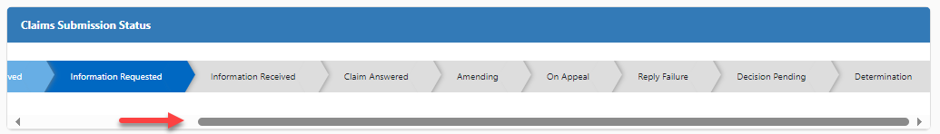
Up to twenty (20) statuses are displayed. The first twenty (sorted by Display Order) are used to populate the Progress Bar.
-
A horizontal scroll bar is used on the target dataform to allow users to view all of the statuses (up to twenty) if there are too many to display all at once on the form:
Suppress Header
Select this option to keep the widget header (i.e., Widget Title) from displaying.
Hide Border
Select this option to keep the widget border from displaying.
Note: Hiding the widget border (and title) causes the progress bar to blend in to the top of the dataform as if part of the dataform. Keeping the border and title retains a traditional widget look and feel.
-
-
Click Save Settings.
The Widget Settings window closes and you are returned to the Widget Layout Details window.
-
Optionally, move or resize the widget frame:
-
To resize the widget frame: Drag the bottom right corner of the widget control to the desired dimensions.
Note: If you are displaying a title and borders or a horizontal scroll bar is being generated to display more than 20 lookup values, the default dimensions work well. If you are suppressing the title and borders to achieve a status bar that blends into the top of the dataform, you may wish to decrease the widget height to reduce the space between the Progress bar and any widget you set to display beneath it.
-
To move the widget frame: Click anywhere in the blue area of the widget control area, hold down the left mouse button and drag it to the desired position on the grid.
Note: Ideally, the Progress Bar widget is set as the first widget displayed in the layout. It is designed to display at the top of a dataform for an "at-a-glance" view of workflow progress.
-
-
Click Save on Widget Layout Details.
-
You are returned to the Widget Layouts list. If your widget layout is new, it is displayed in the list as unpublished. (A new layout is displayed in italics and bold – meaning it is unpublished.)
-
To publish a new widget layout, select the Published option in the far right column.
-
Test the widget on a dataform matching the Target Type you selected in Step 3.
Note:
-
If you make changes to the widget settings and return to an open dataform to test the changes, remember to click the Reload
 button in the Action Center to refresh the form with the latest changes.
 -
Error handling is built into the Progress Bar widget. If there is an issue with the widget settings (such as no Lookup Field identification) that prevents the widget from rendering, an error is displayed in the widget frame as shown in the example image below:

-